Tuesday, 20 January 2009

Budget to Blitz - 2 Layouts and 2 Cards for $10!!

I had the pleasure of working with 3 Pink Paislee papers, a Basic Grey paper, and 3 Green Tara flowers, and by using all of my tools and a couple of little extra things, I was able to create the following 2 layouts and 2 cards for $10!! Most of the products used can be found in the shop: http://www.scrappinpatch.co.nz/. In fact, with the sale on at the moment, if you purchase these products before the end of January, it will cost you much less than $10. Below is the costing for these projects, and the full instructions.


Products Used and Costing:
Pink Paislee Spring Fling papers: Flower Beds, Rain Showers
and Skipping Stones (available here)
Basic Grey Urban Couture Rum Raisin (available here)
Green Tara 4cm flowers (available here)
Total of above: ............................................................................... $7.05
3 sheets of A4 white card .................................................................... 0.21
1 sheet A4 green Bazzill card .............................................................. 0.85
Lace remnant ................................................................................. 0.50 approx
Rubon - unknown, remnant ............................................................... 0.50 approx
3 Heidi Swapp acrylic butterflies ....................................................... 0.90 approx
Making Memories Slice Machine and cartridges (available here)
Cuttlebug Machine, embossing folder and alphabet dies
3D foam
Sewing machine
Alcohol inks
Dimensional Magic (available here)
Flocking powder
Martha Stewart butterfly punch
Fiskars Threading Water border edge punch
Brilliance Ink - Rocket Red
TOTAL: ........................................................................... $10.01

INSTRUCTIONS:
For the Girls' Night In layout, print 5 photos 2.5 x 2" in a long strip with white borders. Cut a 12" circle from the Flower Beds paper, and then cut another circle from the centre of this one, leaving a frame approx 3/4" wide (Fig. 4). Distress the frame, and ink. Cut a slightly smaller circle from the Skipping Stones paper (Fig. 3) to fit inside the frame circle (Fig. 4). Cut an 8" circle (approx) from the Flower Beds leftover paper, and put this aside. Attach a remnant of lace or ribbon to the outside edge of the Skipping Stones paper (Figs. 5 and 6), gathering as you go, ensuring the inside edge will be visible within the frame, then attach the circle frame over the top (Fig. 7). Sew the frame on a machine, using white thread.
Fig.1...............................................Fig. 2 .............................................Fig. 3


Fig. 4 .......................................... Fig. 5 ............................................. Fig. 6
Fig. 7 ......................................... Fig. 8 .............................................. Fig. 9
Use the Slice diecutting machine (Noteworthy cartridge) to cut a frame as shown in Fig. 8, from the Rain Showers paper, and attach this to a piece of the green cardstock. Cut around the frame, leaving a small border. Using a brown pen, draw around the outside and inside edges of the frame, then adhere a rubon as desired. Adhere the photo strip and journalling block, tucking a corner of the photo block into the frame. To make the title (Fig.9), I used my Slice Machine to cut the letters out of white cardstock, inked them with red ink, then put them through my cuttlebug to emboss themwith the Swiss Dots folder. I adhered them to my layout using 3D foam for dimension. Then use a brown pen to journal, and you are done!
Fig. 10 ................................... Fig. 11 .............................................. Fig. 12
For the She Said layout, print a photo 5 x 7", and sand the edges. Trim 1cm off the right hand edge of the brown Basic Grey paper, then cut a hole from the paper from where the photo will be (Fig. 1 above), to use later on a card (ensure you make the hole smaller than the photo). Cut a 3" circle from the Skipping Stones paper offcuts, and a 2.5" circle from a Rain Showers paper offcut. Cut another hole from one edge of the 8" Flower Beds paper circle from where the photo will go, to use later (Fig. 2). Adhere the circles and photo to the page, then sew the edges of the circles on your sewing machine using a mixture of zigzag and straight stitches. Using the Threading Water punch on one edge of the Rain Showers paper, make a border for the page, and adhere then use a zigzag stitch along the inside edge. Next, use alcohol inks to colour the acrylic butterflies, fold up the wings for dimension, and adhere where desired (Fig. 18 below). Use a pencil to draw where you want the flower stems to go, and using white thread in your sewing machine, stitch the stems and leaves, pulling leftover threads to the back of the page and sticking down (Fig. 10). To make the flowers, fold the Green Tara flowers in half, and then pinch the middle of the flower into the shape, as in Fig. 11, and twist slightly. Use a strong glue to hold the flower in this shape, and leave to dry (Fig. 12).

Fig. 13 ............................................... Fig. 14 ........................................... Fig. 15


Cut 2 very small circles, approx 1cm from the Rain Showers paper offcuts, then cut them in half. Dip the bottom of the flower in glue, then, holding the curved edge of the semi-circle to the top, wrap one circle around the bottom of each flower (Fig. 14), then leave to dry (Fig. 15). When dry, put glue on the back of the flower, and attach to the top of the flower stems (Fig. 18).
Fig. 16 ............................................... Fig. 17 ...................................... Fig. 18

Print the journalling on white cardstock, then cut into strips, ink the edges with brown chalk ink, and adhere to page. For the title, I used a Cuttlebug alphabet die cut from white cardstock, then inked red, and adhered on top of white space in photo. And voila, you are done. Fig. 16 shows the back of the layout, with all the cutouts!
For the cards, I made the card base from white cardstock cut to 6 x 8", then folded in half. I used paper offcuts, and green cardstock, cut in strips and layered, and the Threading Water punch on one edge of each card. For the Thanks card, I used a word cut on my Cuttlebug, inked lightly in red ink, adhered and then added Dimensional Magic on the letters. Punch flowers and a butterfly from various offcuts, and adhere to card front, folding up petals and wings for dimension. Put a big round blob of Dimensional Magic in the centre of each flower, and gently add red flocking powder to the top. Use some Kindyglitz on the edges of the butterfly wings.
For the birthday card, use the Threading Water punch on the right-hand egde of the front of the card, which will make the front page of the card slightly narrower than the back page. Adhere a strip of Rain Showers paper on the inside right edge of the card, so that it shows beyond the punched edge. I used the Slice to cut a 3.5" flower, then handcut a stem and leaf, all from offcuts. I cut a circle for the centre of the flower, then Kindyglitzed the edges of the petal, the edge of the punched border, and on the flower centre. When dry, I added a lot of Dimensional Magic to the flower centre to make it look like an epoxy sticker. Stamp greeting in brown ink. Adhere a small strip of Rain Showers paper to the inside edge of the card.
I hope you have been inspired to make some lovely and cheap cards and layouts, using all the tools we have cluttering up our scraprooms.
Tracy le Roy

Monday, 5 January 2009

Scrap Tech Tuesday - Photography Tips


As a scrapbooker, my favourite layouts are the ones with the stunning photos; the ones where the photos almost tell a story on their own, where the subject takes 'centre stage'. Most of us wish we could take better photos, so here are some tips that may help you achieve this. I am by no means an expert photographer; I don't even own an SLR, I have a very good point-and-shoot camera which, until I learn a bit more, remains on the auto settings. But just because you don't own a flash camera doesn't mean you can't improve your photographs. Today I am going to be talking about some basic photography concepts; lighting and compostion, for improving your photographs, making them more eye-catching, dramatic and emotional - without changing from the auto portrait setting on your camera. These techniques are very basic, and many of you may know them, but they can make such a difference to the end result. By making a few changes to the way you take photos, it is easy to ensure your layouts have all the emotion and story you could wish for.

One of the most important things you can do when taking a photo, is to really look through the lens - or rather, at the screen! I know, of course you look, but do you really? Take another look. Look at what is behind the subject; is there anything distracting in the background? Or is there something you want to include in the photo that helps tell the story? How is the lighting? Is there enough light? Are there any shadows on the subject's face? Is the subject squinting? How far/near are you from the subject? Where is the subject placed in the frame? Think about what you are trying to achieve with the photo; what sort of mood are you after?

Spend some time setting up for the photo shoot beforehand, checking where has good lighting, deciding on the mood and theme of the shoot. Maybe putting up a backdrop, and deciding what shots you definitely want to get. Then you can move on to the really important things.

Lighting
Lighting is a crucial factor when taking photos; too much strong light, such as direct sunlight, and your subject may have shadows on their face, and not enough light, and the photo will be too dark, or blurry. A couple of important tips:


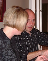
- Do not use your flash if you can help it. Using your flash indoors can change skin colour completely, cause red-eye, and overexpose your picture - as shown at right. Look for natural light indoors, or head out-of-doors for more light.


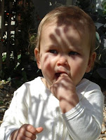
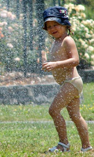
- Avoid shooting photos in direct sunlight, as this can cause shadows on the face, as at right, and these shadows are impossible to correct in any photo editing program. You can take pictures outside during bright daylight, just look for a shady spot such as under a tree (watch out for light speckles through the branches!), or under a verandah - there will still be plenty of light, but no awful shadows. If you can't avoid sunlight, try turning the subject until the sunlight is not shining directly on their face.

- Natural lighting is best. When taking photos indoors, if possible, take the subject close to a large window with plenty of indirect light - you don't want bright sunlight streaming in and causing shadows. Look at your subject, note how the light is falling on their features. Move the subject until you get the look you are after.

- Professional photographers will usually take their own reflector with them on photo shoots. But you don't need an expensive bought reflector; anything white/silver/gold will do. A very large piece of white card, a big sheet of white foamcore; and I actually use my silver car windscreen shield, which works fine. The reflector needs to be held, either by an asistant or the subject, or it can be hung over a chair or propped up on something. You use the reflector where light is needed, for example, if your subject is sitting adjacent to a window, with the light from the window on one side of their face, use the reflector opposite the window to illuminate the other side of their face. If taking a photo in direct, bright sunlight, it may help for the subject to hold the reflector as though it is a book, so that light is being reflected under their chin and nose; wherever shadows may fall.


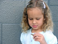
- Catchlights are a lovely addition to a portrait. Catchlights are those little lights in the eyes, as shown in this photo. They draw attention to the subject's face, and make the portrait interesting. Catchlights are made by ensuring your subject is facing the available light.


Composition
We've all seen those photos where the subject/s are halfway down the page, and the top half of the photo is all sky (that's the sort of photo my DH takes!). Composition is all about placing the subject/s in your photo for maximum effect.

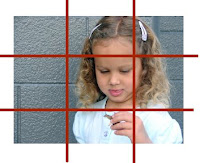
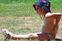
- The rule of thirds is a design principle which you can use to help you decide where your subject should be placed within the photo frame for best effect. Think of it as a grid with 3 sections horizontally and vertically, as shown below left. Rather than placing your subject in the middle of the frame, try placing points of interest, such as the eyes and mouth, at the intersecting points, or along the lines. This makes a photo pleasing to the eye, as the eye is naturally drawn to these points in a photo. This may mean placing the subject off-centre, which may seem unnatural at first, but makes for a lovely and interesting picture. For example, if photographing a person in landscape rather than portrait, try placing the subject on one of the vertical grid lines two-thirds across the photo, and leave the rest as white space. This can be quite dramatic if the white space is not too busy, say if it is a grassy field or blank wall, as here at right.


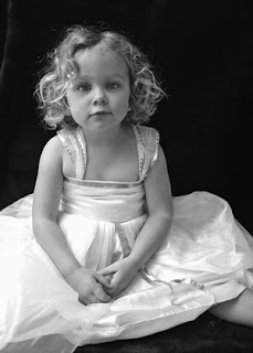
- Another way to ensure you have good composition is to move. Take photos from different angles, from above, from down low, even lying on your stomach - note the photo below right; the angle on this photo makes for a very interesting composition. Use your zoom, take photos from far away and up close, and make sure you get in nice and close - it is quite ok to cut off the top or side of someone's head, as shown in the photo below left. When you think you are as close as you can get, go closer!! Turn your camera and get some portrait shots as well as landscape. Take lots and lots of photos; you can always delete the duds.


When taking photos of my daughter, I set up a "studio" at home. We have a floor-to-ceiling window which gets plenty of indirect light. I sit her with her side to the window, with a blanket or sheet draped over a couple of chairs behind her. Sometimes, I will hang a silver car windscreen shield over a chair on her other side, to act as a reflector - reflecting the light from the window onto the other side of her face. I usually take pics quite close up to her face, as I just love her face!

The following are some of my fave photos, using some of the tips mentioned above:


The most important thing is that you practice, and take lots of photos, and just pay attention to what you are actually taking photos of. Then, you will be able to see what works for you, what you like and what you don't like. There is plenty of reading material on the web; just do a google search for exactly what you are looking for. I encourage you to do a photography course to improve your skills; many high schools run these during school terms and they are inexpensive. Read your camera manual inside and out, over and over, so you know exactly how it works, and then you can get the best out of it. You could also do a google search for your specific camera type, and you will find heaps of interesting info about your camera, and how to use it well.

I hope you have learnt a thing or two, or that I have at least inspired you to learn a little more about photography, whether you are an amateur or a professional photographer. There's nothing better than that photo that just 'speaks' to you, that has meaning and emotion and touches you. Go forth and photograph!!

Tracy

LinkWithin

Related Posts Plugin for WordPress, Blogger...