Showing posts with label crate paper. Show all posts

Wednesday, 7 August 2013

August Sketch Challenge

The month has flown by and the challenge is up late!!!!  All good intentions flew out of the window when my sister arrived last Wednesday from the UK.  In my excitement of seeing her again, and wanting to spend time with her, the blog post was forgotten.  So without further delay, here is the gorgeous sketch chosen by guest designer Vicky Mullen from the Basic Grey blog.


My name is Vicky and I am a scrapbooking addict lol.
I am 44 and have been scrapbooking for 9 years now. I did my first album as a tribute to my late partner and it helped me to heal. These days most of my layouts feature my daughter Katie and my wee granddaughter Lily with a few of my sons who are both in their 20s and seldom let me take photos of them nowadays.
My style is rather eclectic, it all depends on how I feel at the time but I like to use layers and lots of bright happy colours. I also love to use found objects like tags and such like.
I am a stay at home mum, not out of choice but because I suffer from Rheumatoid Arthritis and Fibromyalgia which makes working pretty difficult but scrapbooking keeps me sane while the kids do their best to drive me insane lol. I live in a little village about 30 minutes out of Nelson city with my elderly but active parents, daughter, 2 sons, a cat and half a dozen sheep lol. There is never a dull moment in our crazy household but its always interesting.
thanks for choosing me Adrienne, I hope everyone has fun with the sketch.


.

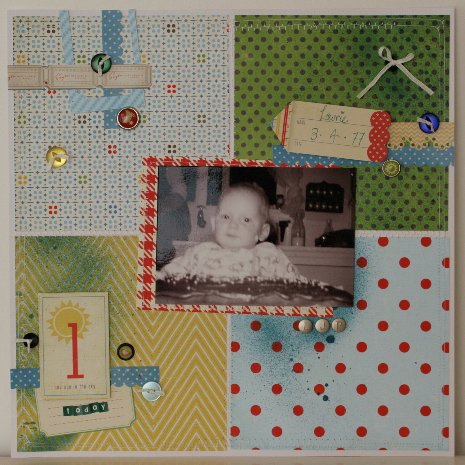
And Vicky's lovely example.


For some added inspiration, guest designer Jessica Toulmin created this lovely layout of her little boy.  Says Jessica
"I turned the sketch 90 degrees to the right.
The collection used is Crate Paper 'Little Boy Blue' , with Tattered Angels Plain Jane 'Teal' mist (and miscellaneous brads, buttons, alphas, ribbon and thread)."

 Looking forward to your take!!!!


Tuesday, 6 August 2013

More Yes Please.....

Hello Everyone, back here again to show you some more inspiration using the lovely colourful Yes Please range from Amy Tangerine

Continuing on from my lash post, this layout is again of SUMMER, they just remind me of summer,


For this layout I have used a pretty simple style, and decorated using some of the Vellum embellishments, and Dimensional Stickers, I just love the lift they give a layout, added a little washi tape, sewing and some very old alpha's and of course some splashes of mist and viola the layout is done.


For this next layout I decided to use the more neutral tones, and go with the greys and pinks


Again a very simple design which has been finished using some washi tape, Crate Photo Overlay, and Crate Pier Embellishment pack, which added that gorgeous blue tone to the layout.

here is a close of those colour Photo Overlays, I added some Foam Tape under the photo as well as some of the embellishments to give the layout a little texture.


Well there you have it, three very different layouts using the same range of papers, hope you have enjoyed the inspiration

TFL & Happy Scrapping
Heidi

Saturday, 3 November 2012

DT Inspiration

Hi everyone!

This month I have the pleasure of working with the Little Boy Blue range from Crate Paper. I had already purchased the Little Bo Peep range which I had fallen in love with. This range is just so adorable!  I love the retro/vintage style and the colours and illustrations.

My first card uses one of my favourite colour combinations - red and powder blue. I love the main illustration of the boy on his push bike. This is from the tag cuts sheet that features a whole heap of different tags - perfect for layouts or cards.


My second card features cute peg details on some yellow baker's twine. I'm really into chevron type patterns at the moment so I used the yellow and white chevron as my base against the natural card.


I hope this provided you some inspiration for your next project.

x Lana

Saturday, 13 October 2012

Its all in the Technique

Morning girls. Well as we know Doilies are really in at the moment but some of my layouts are looking like a tea party with a bunch of blue rinsed ladies, so I felt like I needed to "dirty" them up a bit. This is where your faithful old Modge Podge and an ink pad comes in.

First I lay my doily on my cardstock where I wanted the image then generously applied Modge Podge over the doily paying particular attention to getting the medium within all the little cut out bits. Be generous with the amount you use. I also took my paint brush just around the edge of the doily to create a clean image.


Peel the doily off the cardstock carefully whilst the Modge Podge is still wet and you will have an image like this. It is very important to wait until the Modge Podge is fully set! 


Once dried, and I mean DRIED, rub your ink pad over the image. For mine I used a white ink pad which was nearly on its way out so I could really work into shading etc.


Once done, use a wet wipe and rub lightly over your image where the Modge Podge is and as the ink won't adhere to the Modge Podge it will wipe away leaving a positive image and yet you can manipulate it to how you want using different coloured inks or paints.


I then inked the rest of my card stock to add shading and to make the doily look as though it was part of the paper. This could look great on Heritage layouts using vintage colors.


And here is my finished layout, I hope you've enjoyed this tech and give it a go yourself. Happy scrapping,


Love Belinda


Friday, 31 August 2012

School Notes


Today is my final post here at Scrappin Patch.  I have enjoyed being a part of this group and showing you all kinds of fun things to with what the Scrappin Patch Store has to offer.

In my stash of goodies from Scrappin Patch was this extra long brown envelope.  I decided this would be a great place to keep some keep sake papers from Cole's school year.  I took advantages of all the great embellishments in the School Spirit line.

Thank you all so much for having me here!

See you around!
Sara


Thursday, 23 August 2012

A Little School Spirit Tutorial

Hey Scrappin Patch Fans!  Its Sara Zenger back yet again!
Today I am going to share with you a tutorial and a layout made with the School Spirit line from Crate Paper.  This is by far one of my all time favorite lines from Crate Paper because its can be use for so many other things that are just school.


Lets get started!  I have seen lots of triangles these days and I love them!  Today I am going to show you how to make the triangle pattern on the left side of this layout.

(Please forgive the very bad lighting in my craft room!)
I cut the background sheet of white paper the size I want it to be.  I decided I wanted my triangles to the left of my photo and to take the whole space.  I used a ruler and drew the 3 triangles. Notice they are all going in a different direction but the sides all line up to give it an even look. 


Next I used my craft knife and ruler to carefully cut the triangles out. 


Now we have 3 negative triangles on our background sheet.

 Next I carefully cut 3 pieces of paper to fit behind my negative triangles. 

Then adhere those papers to the back side.  

Now our triangles are complete!


Like what you see?  Get your own School Spirit now from the Scrappin Patch Store!


Tuesday, 15 November 2011

Inspiration Wednesday with Francine- Crate Paper - Part 2

Hi Ladies and welcome to Inspiration Wednesday.

This week i wanted to share the second layout that i completed with the beautiful Crate Paper range "Portrait". This range covered alot of colour options- from red and green to brown and to black and white and yellow also which makes it very versatile to use for whatever photos you would like to scrap.

For my second layout i wanted to show you how you can use yellow- as i know that a lot of people hate yellow and tend to avoid using the colour in their albums. I think of yellow first and foremost as a happy summery colour but i think that when you use yellow and black and white it can also look stylish and elegant. That was the effect that i was going for in this layout! I tried to keep the layout pretty simple because i wanted the photos to be the dominant force of the layout and yellow and black is a pretty striking combination which i feel doesn't need alot of embellishing!

 I decided  to layer my papers in a horizontal direction and used a series of punches to give the layering some extra interest. Here is a close up...

I hope that i have managed to show you 2 different looks and colour schemes that can be used with this range and that you will have a bit of play with them too!

happy Scrapping

Francine

Products Used
Crate Paper- Portrait Collection- Honeymoon
Crate paper- Portrait Collection- Vintage Lace
Pink Paislee- Nantucket Ribbon trim
Cheery Lyn Dies- Fanciful Flourish
Prima Flower
Prima Leaves
Basic Grey Black Alphas
Crate Paper Diecuts
White Bazzill Cardstock
Martha Stewart Punches

Wednesday, 2 November 2011

Inspiration Wednesday with Francine- Crate Paper

Hi Ladies and welcome to Inspiration Wednesday. This week Adrienne gave me some of the Crate Paper- Portrait collection to create with. This range comes in a variety of colours from black and grey to yellow and soft green and reds- so it covers almost the whole colour spectrum! I designed 2 layouts with my kit - one that i will share today and one next week.

This first layout i decided to step out of my comfort zone a little and focus on the reds and greens- not colours that i traditionally would use but i was happy with the end result! I layered lots of the paper and by cutting out various squares and using the back sides of the papers too- you can get a multi' layered effect from just a couple of pieces of paper. I handcut some of the flowers from the flowery paper to use on my layout too and only added a few smaller flowers to bulk it up a little.


By adding some punched edges and some punched butterflies ( how do i love thee Martha Stewart) and a few other embellishments it added to the texture and visuals of the  layout. I hope that you will give this range a try - it would be great for both boy and girl layouts- vintage layouts too- something for everyone!
I'll be back with yellow- a colour that most people avoid and black next week- to show you how you can create something simple and striking with these colours and this range.

Happy Scrapping
Francine

Products Used

                                              Martha Stewart Punch- Large Monarch Butterfly
                                         Jillibean Soup- Chipboard Alphabeans- Newsprint
                                                   Elements Pearl Brads - Metallic
                                                        Pink Paislee Brown Paper
                                              Martha Stewart Deep edge heart punch
                                                           Prima Red Flowers
                                                   Kaisercraft Chipboard Hinge
                                                         Crate paper Diecuts
                                                                     Ticket

Monday, 5 September 2011

September Off The Page Challenge


Hi everyone - it's time to introduce the OTP challenge for September. This month I would like you to make an Artist Trading Card that stands alone as a piece of art, then use your card on a larger item. You can use your ATC on a greeting card, decor item, giftbox or scrapbook page.

If you haven't made an ATC before it is SO easy! Cut your base card at 3.5 inches x 2.5 inches then decorate as desired. Traditionally, Artist Trading Cards are made flat and stored in sleeves designed for baseball cards, but I say break all the rules! Decorate your ATC however you like - you're the artist!


Here's my ATC. I cut apart the petals of my prima flowers so I could adhere them to the back of the sentiment layer exactly how I wanted them.

And here's the card I created using my ATC as the focus....


You can make the ATC removable if you like, I do this sometimes and put a strip of magnetic tape on the back so the inspiring card can be kept on the fridge.

Here's a little peek inside the card....


I hope you'll join in this month and make your very own ATC and use it on a larger item. I can't wait to see what you come up with!

Supplies:
Emma's Shoppe Paper - Crate Paper
Out of Print Paper - Basic Grey
Liquid Pearls in Baby Blue
Barn Door Distress Ink
Crochet Trim
Prima Flowers
Leaf Trim
Button
Twine
Verve Visual Stamps
Verve Curvy Bookplate Die

Wednesday, 25 May 2011

Wednesday Inspiration with Hannah

Hi girls,

It's time to post some more inspiration, and today I want to share 2 layouts featuring Crate Paper "School Spirit". These papers are obviously fantastic for school layouts, but they are very versatile and can be used for other themes as well (as you will see).

In this first layout, I teamed some of the School Spirit papers with Kraft cardstock and Prima autumn leaves to scrap this photo of Tyler at the "Amazing Maze in Maize" last Easter. I cut the "Geometry" paper into coloured blocks - the colours were perfect! In keeping with our "Along the Lines" theme for the month of May, I've used a black journalling pen to doodle a fun & easy lined border around the edge of my page.

Image

Products used:
Crate Paper School Spirit "Geometry"
Crate Paper School Spirit "Grade Card"
Kraft cardstock
Prima "Say it in Pearls" black fern
American Craft Thickers "Bones"
Cosmo Cricket Tiny Type Alphas
Prima autumn leaves
Prima flowers
buttons
journalling pen
ink

Here I've used the School Spirit papers to scrap more of those school photos! I wanted to capture how much Ethan has changed over the last 5 years, so I used a photo from each school year to show the transition. I cut out numbers from the "Chalkboard" paper to represent each year. I utilised the grid paper to keep with the "Along the Lines" theme, and also added strips or "lines" of overlapping patterned papers and tape across the middle of the page.

Image

Products used:
Crate Paper School Spirit "Grade Card"
Crate Paper School Spirit "Study Hall"
Crate Paper School Spirit "Chalkboard"
Basic Grey Basics "Kraft Poll"
Sassafrass Lass Me Likey "Refreshed"
Heidi Swapp tape
old book page
misc. buttons and charm
My Minds Eye Life Stories "Team" journal card
Prima Alphabet Stickers "Tan"
journalling pen
ink
corner punch

*** EXTRA, EXTRA! ***

Yesterday a few of you were talking about challenges and how you couldn't wait for the June ones (next week), so I am offering a little "extra" challenge. Hopefully you've been inspired by these layouts, so I'm challenging anybody who wants to play along to create a layout based on this post. You can scraplift one of my layouts, use one as a "sketch", use the same colour palette, take inspiration from the titles, or create your own "recipe" based on some of the ingredients I have used.

Upload to this folder in the gallery: http://scrappinpatch.co.nz/coppermine/t ... ?album=418

I will offer a small RAK, and I will randomly draw a winner on Sunday afternoon.

Happy scrapping! :-)

Tuesday, 30 November 2010

ScrapTech Tuesday - Using Transparencies

I thought I share a couple of ideas with you when using a Transparency as a background, Transparencies are really cool to work with, even if it is not as a background but simply a journal spot, it just always adds that extra touch.

On this layout I have used the Fancy Pants Summer Soiree Paradise Transparency as the main background. As the main colour printed section of the Transparency was mainly at the bottom of the page, I used the square coloured frame as the main section for my main photo, and then added two extra photo's towards to the top of the page to highlight our trip. You know we always take those gropu photo's when you go somewhere and then heaps of photo's of wherever you are going but we rarely scrap those photo's because whilst they are nice to have, well they don't have people in, so we tend not to scrap them.

Image

Products used:-
Fancy Pants Summer Soiree Paradise Transparency
Crate Paper Sew Brads - Snow Day Collection
Lime Rickey Rubons (Basic Grey)
Jenni Bowlin Cardstock Alpha Stickers - Red Trim
Basic Grey Curio Mino Mono Stickers Red
October Afternoon Mini Market Alpha Stickers - Teal & Black
Scenic Route Afterthoughts Colour Rubons

Image


Products used:-

Fancy Pants Lilac House Transparencies
RoseMoka - Vintage Glam PP
Prima Flowers
Websters Trim
2crafty Chipboard Title
October Afternoon Mini Alpha Stickers
Tim Holtz Filmstrip Ribbon
Bazzill Cardstock - Butter Cream

here are a couple of ideas to use with your transparencies....

1. You can use Glue Dots or Double Sided to adhere the transparency onto cardstock / PP
2. You can use Paint
3. You can use Glimmermist on the Transparencies but spray lightly
4. You can use Alcohol Inks
5. You can use Stazon to stamp on transparencies
6. You can use Rubons directly onto transparencies

Don't be shy - give it a go....

TFL & Happy Scrapping

LinkWithin

Related Posts Plugin for WordPress, Blogger...